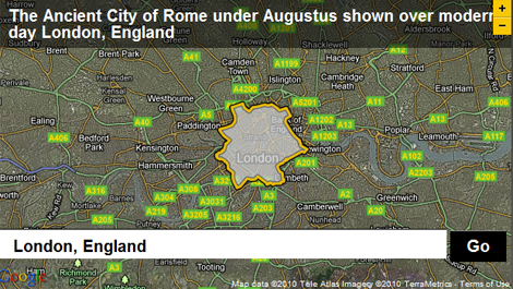
 An interesting concept powers a new website launched by the BBC called Dimensions, which uses data from historical sources to map the area of ancient sites such as the Long Walls of Athens, Stonehenge and the Great Library of Alexandria. The outline of these heritage sites can then be overlayed on top of any other area, so you can see the size of the ancient cities relative to where you live yourself!
In a similar sort of scheme as the recent oil spill disaster in the Gulf of Mexico (which saw the British Museum targetted as part of a protest against BP) where an outline of the spillage area could be overlayed anywhere in the world to scope the magnitude of the disaster, the BBCDimensions website allows you to explore the magnitude of how big the cities and key monuments of our ancient ancestors’ world were.
It’s not just sizes of ancient world sites which feature in the website, however, as other outlines developed include the route of Hannibal as he marched from Spain over the Pyrenees and Alps mountain ranges using elephants and led the invasion of Italy, defeating the Romans in numerous battles. And speaking of the Romans, you can also see how large the city of Rome was under the rule of Augustus, as he embarked on the huge rebuilding and social reform project around 15BC. Though if you’re from a small town like me, maybe you’d feel more in scale just to see how large the Colosseum was compared to your local stadium!
It’s certainly an interesting project, and allows users to compare the scale of what the ancient world achieved when compared to the modern age. Check it out over at BBCDimensions, and let us know if you find any interesting comparisons!